
every day we live in a world where products, situations. and experiences often are designed in a certain way, but because these are the smallest things which can cause a discomfort and often a diversion in a way we interact with these objects, services, often we tend to ignore them thinking;
we are dumb enough not to get it, but as a designer, i feel responsibility comes from the makers of things to enable the user at ease always.
felt the need to start and share these small design errors which could have been designed in a way for better user experience.
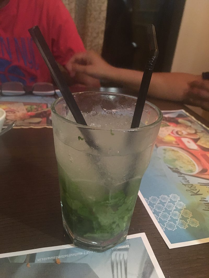
Recently had visited this restaurant where they gave me a drink which had a starter and the straw, although quite common this time the two were in same color, shape, size and even height making it absolutely obvious for the user to get confused.
As the main motto of the evening was just having a good conversation Ias constantly struggling between looking for my straw while listening to my friend talking.
What would have been really helpful in this case would have been if the drink had just one unit that could do both.
Or the drink would have been pre-stirred instead of creating a visual layer.
Just a thought what if the glass could be built in a way we don’t need a stirrer.
This made me realize how such a simple thing like a straw and stirrer can add up to a bad experience and ultimately a bad feedback to the restaurant.